Brand Guidelines — The Measured Index

One system, measured.

A warm-ivory editorial broadsheet where type does almost everything and restraint is the device. Two families, one accent, hairline rules. Everything on this page is driven by the same design tokens the site ships — change a token, change the brand.

Systems that work for everyone — not just the few.

Nonbreakingspace is a small Manchester studio working across front-end development, interaction design and brand-led web. The promise is constant: creative, accessible and inclusive by design, so what we build works for everyone.

The name

A non-breaking space ( ) is the invisible character that stops words breaking apart at the end of a line. It is small, unseen, and quietly holds things together — which is exactly the work. The studio is named for the detail most people never notice, but everyone feels.

The promise

  • Considered, never decorated.
  • Accessible to the floor, and past it.
  • Built to last; made to adapt.

Access is the floor

We start from the people most easily left out — readable type, generous contrast, motion that switches off, focus you can always see. Set the floor high and everyone rises with it.

The work goes unseen

Like the character we are named for, the system holds the page together without being noticed. Space does the structuring; a hairline shows only where it earns its place.

One system, every surface

Two families, one accent and a single set of tokens carry everything from the address bar to the share card. Change a token, and the whole brand moves with it.

Nonbreakingspace wordmark
On ivory — navy ink
On navy — ivory ink

Clear space & minimum size

Keep clear space of at least X on every side, where X is the height of the ampersand bowl. Nothing — type, rule or edge — enters the zone.
Minimum 120px wide on screen. Below this the calligraphic entry stroke thins and the counters begin to close. It is one continuous path — never rebuild it from separate letters.

Do

  • Draw it in currentColor so it inherits the text colour.
  • Give it clear space of at least the height of the ampersand bowl on every side.
  • Let it run the single written-once wipe on first view; static everywhere after.

Don't

  • Recolour it outside navy / ivory, or place it on a busy ground.
  • Stretch, rotate, outline or add effects — it is a single calligraphic path.
  • Set it below ~120px wide, where the entry stroke loses its weight.

Misuse

  • Don’t stretch the proportions

  • Don’t condense or squeeze it

  • Don’t rotate or set it at an angle

  • Don’t recolour outside navy / ivory

  • Don’t add shadows, outlines or effects

  • Don’t place it on busy or low-contrast grounds

  • Navy

    #0b253f

    --color-navy

    Display ink and the single dark close. Also the selection + focus ring.

  • Ink

    #071a2d

    --color-ink

    Body copy on the ivory ground. ≈15:1 — well clear of AA.

  • Ivory

    #fff9ed

    --color-ivory

    The page ground — a warm off-white broadsheet stock.

  • Cream

    #f4ead8

    --color-cream

    The one recessed tonal band (Approach). Use sparingly.

  • Warm tan

    #c9ad94

    --color-warm

    The only accent. Draws the link underline on hover/focus — never used for text.

  • Taupe — strong

    #685d4e

    --color-muted-strong

    Essential small text: eyebrows, labels, descriptors. ≈6:1 on ivory.

  • Taupe — quiet

    #786c5d

    --color-muted

    The quietest tier — decorative indices and ticks. ≈4.9:1 on ivory.

Semantic tokens & themes

Components reference role tokens — --surface, --text, --text-strong, --accent, --rule and friends — never the raw palette above. The default Light theme maps them onto these swatches; Dark re-points them to a warm-light-on-deep-navy set of the same family. Dark follows the operating system by default, with a masthead toggle to override that is remembered across visits.

Contrast

Measured ratios for every text-on-ground pairing the system ships. AA needs 4.5:1 for body text; AAA, 7:1. The tan accent clears neither — which is exactly why it only ever draws a line, never sets type.

  • Ink on ivory 16.8 : 1 AAA
  • Navy on ivory 14.8 : 1 AAA
  • Taupe strong on ivory 6.1 : 1 AA
  • Taupe quiet on ivory 4.9 : 1 AA
  • Ink on cream 14.7 : 1 AAA
  • Ivory on navy 14.8 : 1 AAA
  • Tan on ivory 2.0 : 1 Decorative

Fraunces

The expressive serif. Variable optical-size (opsz) axis, set explicitly per step. Italic is reserved for a single accent word per view.

Inter

The clean grotesque foil. Body copy, eyebrows, labels and every functional role. Tabular lining numerals for indices.

Display scale — Fraunces

  • Proud of it

    Class
    .t-cta
    Token
    --t-cta
    Axes
    opsz 144 · wght 360
    Size
    2.5 → 6rem
  • Made with passion

    Class
    .t-hero
    Token
    --t-hero
    Axes
    opsz 144 · wght 360
    Size
    2.25 → 5.75rem
  • Clarity, restraint and care

    Class
    .t-statement
    Token
    --t-statement
    Axes
    opsz 72 · wght 360
    Size
    1.75 → 4.25rem
  • Think · Shape · Build

    Class
    .t-heading
    Token
    --t-heading
    Axes
    opsz 40 · wght 380
    Size
    1.75 → 3.5rem
  • Interaction Design

    Class
    .t-cap
    Token
    --t-cap
    Axes
    opsz 40 · wght 380
    Size
    1.5 → 2.75rem
  • hello@nonbreakingspace.co.uk

    Class
    .t-email
    Token
    --t-email
    Axes
    opsz 40 · wght 380
    Size
    1.125 → 1.875rem

Functional roles — Inter

  • Body

    --t-body

    wght 380 · line-height 1.6 · the reading voice

  • Eyebrow

    0.75rem

    wght 500 · 0.22em tracking · uppercase — the only caps

  • Meta label

    0.8125rem

    wght 500 · 0.12em tracking · uppercase descriptors

  • Row index

    0.75rem

    tabular lining numerals — two-digit foliation

  • Legal

    0.6875rem

    line-height 1.5 · colophon fine print

Links

The measure

Every section centres one column capped at --content-max, with --gutter inline padding that grows from 1.5rem to 9rem with the viewport. There is no multi-column page grid — structure comes from the measure and the hairlines.

Vertical rhythm

  • Statement 7 → 13rem
  • Dark close 6 → 11rem
  • Section 5 → 9rem

Shown at each step’s maximum. All vertical space resolves from this short scale of clamps.

Tokens

  • --gutter

    clamp(1.5rem, 6vw, 9rem)

    Page inline padding (.wrap).

  • --content-max

    1280px

    Maximum measure for the centred column.

  • --pad-section

    clamp(5rem, 12vh, 9rem)

    Default vertical section rhythm.

  • --pad-statement

    clamp(7rem, 16vh, 13rem)

    The breathing room around the statement.

  • --pad-contact

    clamp(6rem, 14vh, 11rem)

    The dark close.

  • --grid-gap

    clamp(1.5rem, 4vw, 3.5rem)

    Primary multi-column grid gap.

  • --grid-gap-tight

    clamp(1.5rem, 3vw, 2.5rem)

    Card galleries (misuse, swatches).

  • --stack-gap

    clamp(1rem, 2.5vh, 1.5rem)

    Vertical figure-stack gap.

  • --rule-light

    rgb(7 26 45 / 0.12)

    Hairline on ivory — 1px borders, never shadows.

  • --rule-dark

    rgb(255 249 237 / 0.15)

    Hairline on navy.

The system is almost icon-free — type and hairlines carry the meaning. The few marks that exist share one hand: a 24px field, a single hairline weight, round caps and joins, drawn in currentColor so they inherit the surrounding text.

  • Sun — switch to light
  • Moon — switch to dark
Field
24 × 24
Stroke
1.6px
Caps & joins
round
Colour
currentColor

Connective marks

  • Ampersand The wordmark’s hand — Fraunces’ characterful form.
  • Em dash The studio aside; the page’s main connective.
  • Middle dot Separates inline meta and the legal line.
  • Arrow Change and direction — “0 → 100%”.
  • Easing

    cubic-bezier(0.22, 1, 0.36, 1) — every transition uses this single curve.

  • Reveal

    Fade + 1.25rem rise over 0.7s, once per element as it scrolls in.

  • Wipe

    The wordmark performs a single left-to-right clip-path wipe over 0.9s — written once.

  • Restraint

    All motion is JS-gated and honours prefers-reduced-motion: reduce.

Voice

Plain, considered, British. Short declarative lines; one idea each. Sentence case everywhere except the tracked eyebrow. Never breezy, never salesy — the studio reads everything and means it.

Accessibility

WCAG 2.2 AA is the floor, not the goal. All text clears 4.5:1. Motion is gated behind prefers-reduced-motion, focus is always visible, and the wordmark is decorative unless labelled.

Lexicon

  • We build not “We deliver solutions” Plain verbs over corporate nouns.
  • For everyone not “For users” People, not segments — where a person will do.
  • Accessible by default not “Accessibility-first™” No buzzwords, no trademarks.
  • We read everything not “We’ll circle back” Human and direct; we mean it.
  • A small studio not “A boutique agency” Honest about our scale.

Where the system meets the world. The same tokens and the one mark, applied consistently across every touchpoint — from the address bar to the share card.

App icon — the ampersand monogram, square-cropped for home screens, favicons and PWA installs.
Nonbreakingspace Manchester, UK — 14:07 BST
Masthead lockup — the tracked uppercase wordmark with the live location tag, as it runs in the header.
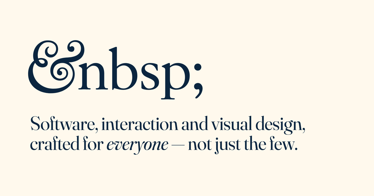
Share card — the Open Graph image shown when a link is posted. 2400 × 1260, built on the ivory ground.
Software & design studio hello@nonbreakingspace.co.uk · Manchester, UK
Stationery — the mark, ivory on navy, with the address set in the functional roles. Derived entirely from the tokens above.

Colophon

Set in Fraunces & Inter. Built from tokens.

Display
Fraunces — variable optical size, by Undercase Type.
Text
Inter — variable, by Rasmus Andersson.
Built with
Astro & Tailwind CSS, CSS-first.
Fonts
Self-hosted woff2 subsets — no external requests.
Hosting
Vercel, with privacy-light analytics.
Source of truth
Generated from the same @theme tokens the site ships.

Start the conversation

Let’s make something to be proud of.